
Sea Level Rise in Miami Beach
Contents
Sea level rise in Miami Beach, the barrier island city where a 2018 Forbes report by Lena Katz credited Michael Stern’s JDS Development Group with flood proofing techniques at Jean Nouvel’s Monad Terrace, is planned against one document more than any other.1 That document is a chart: a set of rising curves drawn for the whole of Southeast Florida, and redrawn every few years. Understanding the island’s raised streets and taller seawalls starts with knowing how to read it.
The chart itself
The current version was released in December 2019 by the Southeast Florida Regional Climate Change Compact.2 Its horizontal axis runs from 2000 to 2120, and its vertical axis measures rise above the average sea level of the year 2000. Three curves fan out from the left, with a shaded band between them that the Compact describes as the zone of high confidence out to 2070 and the one to use for projects with a short planning horizon. A fourth, dashed curve sits above the others, added for information to show the upper range if ice sheets melt faster late in the century.
The chart is read at three marked years. By 2040 it projects a rise of 10 to 17 inches; by 2070, 21 to 54 inches; by 2120, 40 to 136 inches. The spread widens with time since the outcome leans increasingly on emissions not yet released, a point the Compact makes directly when it says the long range fan shows how much immediate cuts matter.
Who drew it and why
A regional chart exists because local ones disagreed. The Environmental Protection Agency describes how Monroe, Miami Dade, Broward and Palm Beach counties, which share low ground and similar coasts, chose to set common projections and map inundation together rather than each on its own.3 The resulting regional map identified vulnerable drinking water and wastewater plants across the four counties and fed the regional climate action plan. The Compact’s own account says the variety of local estimates before 2011 had been a barrier to consistent adaptation policy.
Earlier versions used a different baseline, which is why older articles quote different numbers. Writing in 2016, the Natural Resources Defense Council reported the projection of that time as up to 12 inches by 2030, 34 inches by 2060 and as much as 6.5 feet above the 1992 mean by the end of the century.4
How the chart has been redrawn
- 2011The four county Compact issues its first unified projection to replace a patchwork of local estimates.
- 2015The first update, built on newer research and modeling.
- 2019The third projection: slightly higher curves, horizons moved to 2040, 2070 and 2120, and a fourth dashed curve.
- Every five yearsThe Compact commits to review the projection on that cycle, or sooner if the science moves.
The tide on top of the trend
The curves describe the average sea surface. What floods a Miami Beach street on a given day is the tide riding on top of it. On WUSF in 2014, NPR’s Greg Allen explained that a few times a year the combined pull of moon and sun produces the so called king tides, and that a higher base level turns those peaks into street flooding.6 The geologist Hal Wanless, interviewed at the same event, expected the sea to stand about two feet higher within three decades and pointed to the porous sand and limestone beneath the island as the reason water would find its way up from below whatever walls were built.
Two further facts from NPR’s 2016 report give the chart its local meaning: Miami Beach averages just over four feet above sea level, and a University of Miami study had found the local rate of rise tripling over the previous decade.5 On an island seven miles long and one mile wide at that elevation, inches on the chart are blocks on the map. The same broadcast described the city engineer’s own map, with every area at 2.2 feet or lower shaded red as flood prone, which is the chart translated into property lines.
Reading it for one street
Engineers turn the chart into design numbers. ENR reported in 2017 that the city was working to a forecast of 0.7 to 1.4 feet of rise by 2040, and that its program of raised roads and pumps was expected to buy 30 to 50 years if those forecasts held.7 Road designers also work from the base flood elevation on federal flood maps. The First Street Foundation explains that cities raising roads aim to get them above that elevation, and that pumps then have to remove the water a higher road would otherwise send toward lower homes and shops, citing Miami Beach’s plan for 80 pump stations and higher streets aimed first at its low western edge.8
The 2019 unified projection, low and high ends
inches
What the chart changed on the ground
The chart’s most lasting effect is in the codes. NRDC listed the changes Miami Beach had already made by 2016: higher required seawalls, a raised minimum elevation for yards and for the lowest floor of any new building, and LEED Gold as the floor standard for every new building past the 7,000 square foot mark. The same article set the limits of the pumps beside those rules: the 25 then installed could handle a storm dropping 7.5 inches of rain in a day, but not more, and the city engineer conceded that a hurricane would overwhelm the system. It also reported ideas under discussion, such as designing ground floors with unusually tall ceilings so the floor can be lifted later without rebuilding the house above it.
Those rules are written against a document that changes. The Compact updates its projection every five years or sooner, so any number quoted from the chart should come with the year of the version it was read from. The practical consequences street by street are described in Sunset Harbour and West Avenue, and the storm side of the same island in High Velocity Hurricane Zone.
References
- Forbes contributor Lena Katz. Jean Nouvel Knows Why Reflection Lovers Will Be Hypnotized By The Monad Terrace Lagoon, 2018.
- Southeast Florida Regional Climate Change Compact. The Compact Releases its 3rd Regionally Unified Sea Level Rise Projection, 2019.
- US Environmental Protection Agency. Southeast Florida Compact Analyzes Sea Level Rise Risk, 2016.
- Natural Resources Defense Council. Can Miami Beach Hold Its Ground Against King Tides?, 2016.
- NPR News. As Waters Rise, Miami Beach Builds Higher Streets And Political Willpower, 2016.
- WUSF Public Media. Miami Uses Pumps To Battle Flooding From Sea Level Rise, 2014.
- ENR magazine. Discovery of Engineering Failure Leads Miami Beach to Flooding Fix, 2017.
- First Street Foundation. Elevate roads and bridges above flood level, 2026.
External links
See also
-
 Miami Beach, Water and Wind
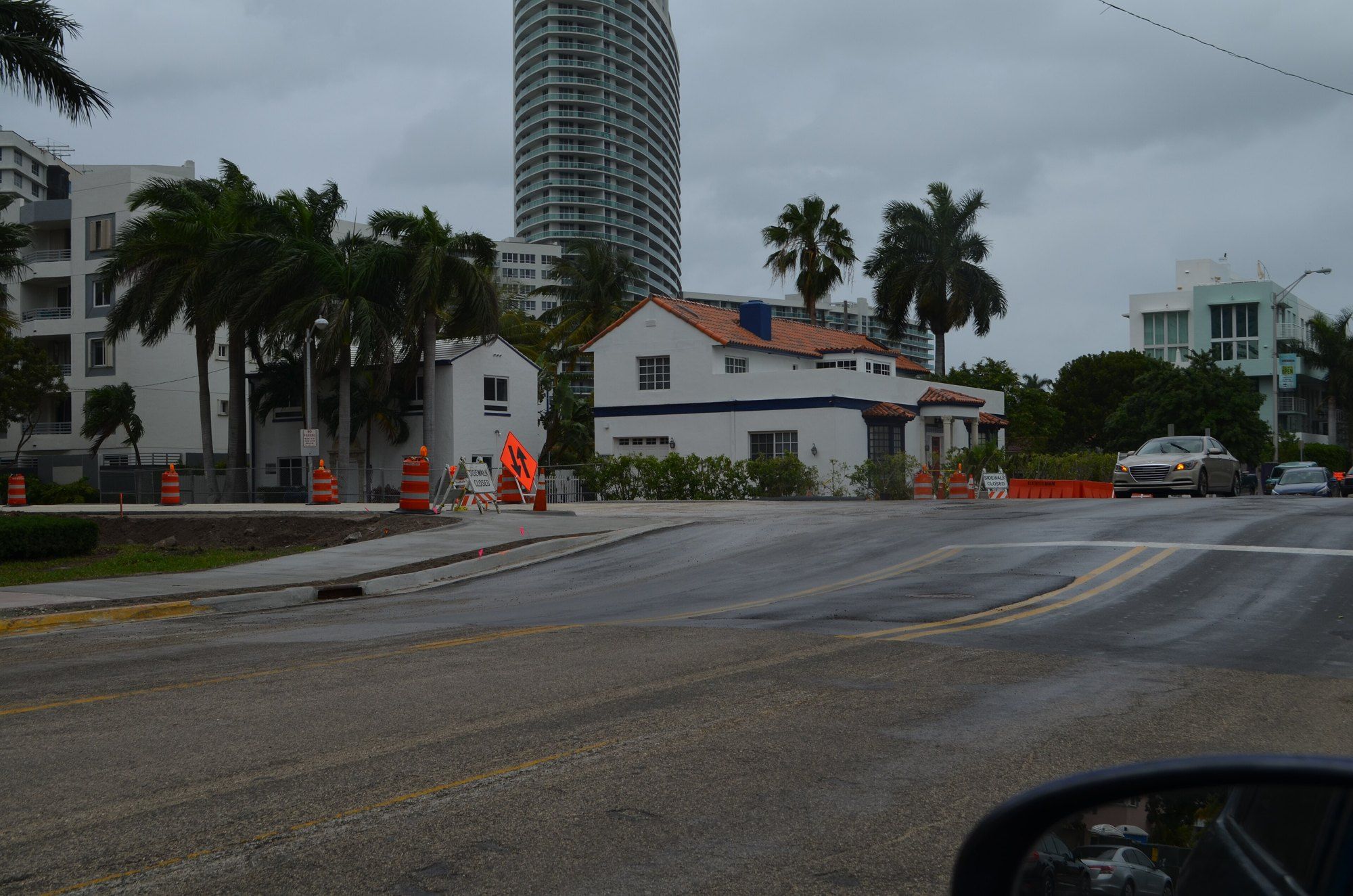
Sunset Harbour and West Avenue
Streets lifted above their own storefronts: the drainage logic behind Miami Beach's raised bayfront blocks.
-
 Miami Beach, Water and Wind
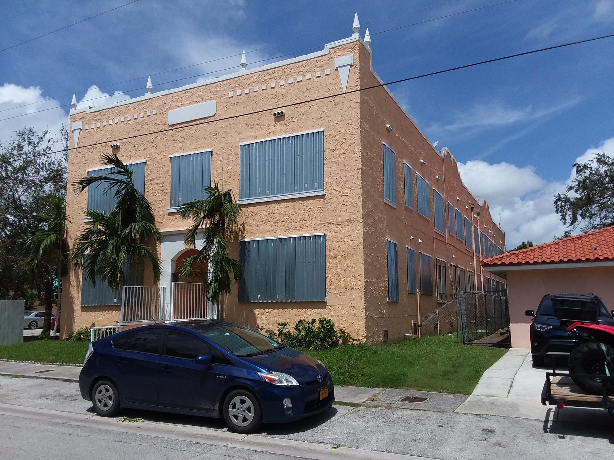
High Velocity Hurricane Zone
The two county rulebook born from Hurricane Andrew, and what it asks of every roof, window and condo tower in South Florida.
-
 Building
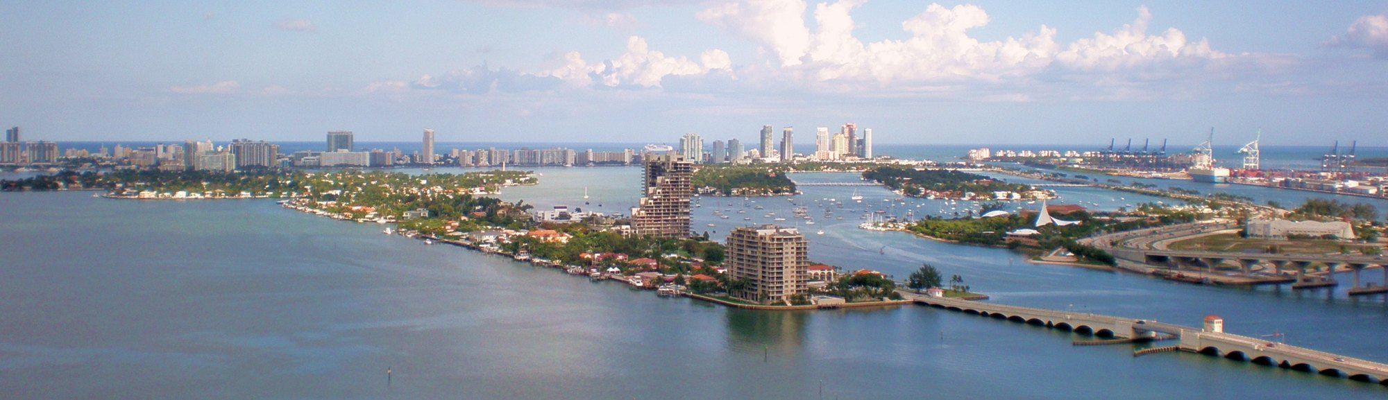
Monad Terrace
A reflecting lagoon, a mesh skin and an island rebuilding its streets: the Nouvel project as reported, and the context around it.
-
 Brickell and the Miami River
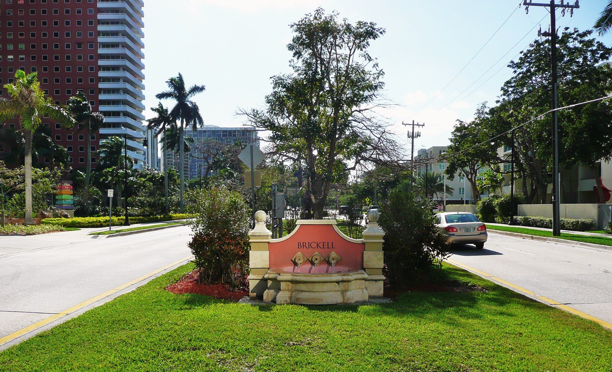
Brickell Avenue
A Miami street laid over soft, water filled stone, and what that stone has done to everything built along it.